Penelope
A 401(k) record keeper with a solid platform trapped behind a complex participant experience. We redesigned 20+ screens — new design system, new UX, full mobile responsiveness.
The Bet
Penelope is a modern 401(k) record keeper — the system-of-record that tracks every dollar flowing through an employer-sponsored retirement plan. Contributions in, investments allocated, vesting calculated, loans serviced, distributions paid. The platform underneath was solid. The participant experience needed a design to align with the platform underneath that was solid.
Penelope needed a team that could assess the current state, propose a complete design direction, and rebuild the entire participant-facing layer — fast. Not in quarters. In weeks.
The Complexity
401(k) participant dashboards are deceptively complex. Every screen has to surface the right information for people who may not understand financial terminology — while remaining precise enough for a regulated record-keeping system.
A single home screen needs to show total balance, retirement projections, contribution breakdowns across pre-tax, Roth, and employer match buckets, portfolio allocation, rate of return, and recent activity. Account details span transactions, vesting, loans, beneficiaries, and rollovers — each with its own rules and edge cases. Investment views need to display performance at both the portfolio and individual fund level, with transfer and rebalance capabilities built in.
Then there’s the regulatory layer. The dashboard generates quarterly retirement statements that must match the format participants expect from their financial institution. Documents like plan descriptions, safe harbor notices, and fee disclosures need to be accessible and organized.
All of this had to work just as well on a phone as on a desktop. The existing experience wasn’t mobile-responsive — and most participants check their 401(k) on their phone.
The Thinking
We started with three to four weeks of strategy before writing a line of production code.
Daniel Urruela, our Design Lead, assessed the existing participant dashboard end to end — mapping every screen against real participant needs, identifying where the experience created confusion, and profiling what information architecture changes would deliver the most value. The goal wasn’t to catalog every issue. It was to determine where we’d get the highest return in a compressed timeline.
That phase produced a complete design direction proposal: a new color palette, new typography, new UI component patterns, and a redesigned information hierarchy — all presented to the Penelope team in a single kickoff presentation. The proposal didn’t just show what screens would look like. It explained why each decision would improve comprehension, reduce clicks, and make the dashboard feel modern without losing the trust signals that matter in financial services.
Paulo Justiniano led product management, translating the domain complexity of 401(k) administration into clearly specified user stories with detailed business rules, acceptance criteria, and edge cases. His specifications gave the engineering team everything they needed to build without ambiguity — critical when every screen handles real financial data.
With the design direction approved and stories specified, the team moved straight into delivery.
The Build
Dulce Hernandez Cruz and Italo Lino rebuilt the participant experience screen by screen across four weeks, working in a continuous Kanban flow.
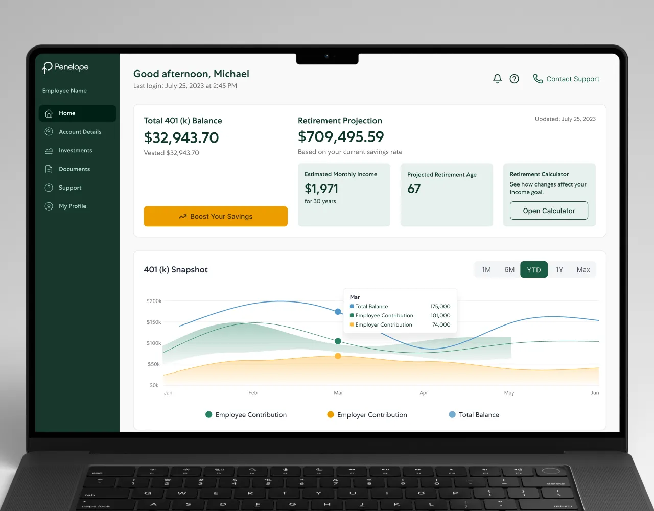
Home Dashboard — Total 401(k) balance, retirement projection with monthly income estimate, contribution snapshot charting employee versus employer contributions over time, portfolio summary, rate of return, and recent activity — all on one screen, all responsive.
Account Details — Four distinct views: balance with vested and rollover breakdowns, transaction history with filtering, contribution elections with payroll timing, and beneficiary management with allocation controls. Each view designed to answer a specific question a participant would ask without requiring navigation to find the answer.
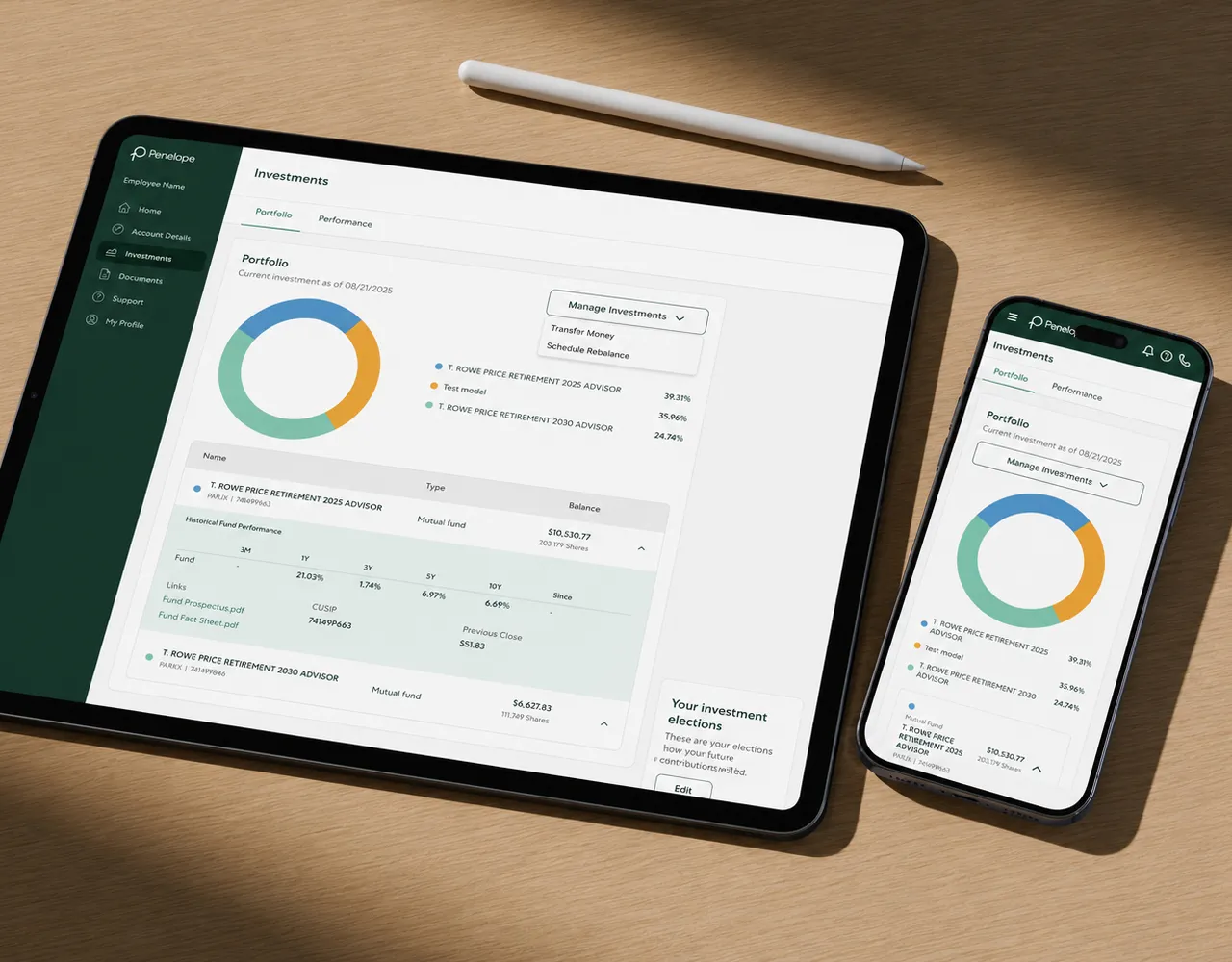
Investments — Portfolio overview with fund-level allocation, performance tracking with time-period toggles showing total gains and rate of return per fund, plus transfer and rebalance workflows that walk participants through changes step by step.
Documents, Support & Profile — Reference documents organized by type, quarterly statements going back to 2023, an FAQ section addressing common 401(k) questions, and a complete user profile with personal, contact, employment, and notification preferences.
Retirement Statement PDF — A custodian-style quarterly statement generated as a PDF, matching the format participants expect from established financial institutions while pulling live data from Penelope’s record-keeping engine.
Every screen was built mobile-first. The responsive layouts weren’t an afterthought — they were the starting point. Hamburger navigation, stacked card layouts, and touch-optimized interactions were designed for the way most participants actually access their 401(k): on their phone.
The Proof
Across the engagement, 11 stories delivered through continuous Kanban flow. Over 20 screens redesigned and shipped — from the home dashboard to investment performance to multi-step loan applications — with an average cycle time of 6.4 working days per story.
The participant dashboard was transformed into a fully responsive, modern experience built on a cohesive design system. Information that previously required multiple clicks now surfaces immediately. Mobile layouts that didn’t exist are now the primary design target. Quarterly statements now match the visual language of the dashboard itself.
The frontend rebuild required close coordination with Penelope’s internal engineering team. Their existing component library needed backend adjustments to support the new design system, and the two teams worked asynchronously through Slack to align on implementation — ensuring every API contract and data structure served the redesigned screens without disrupting the live platform.
The Partnership
Penelope is a case study in focused execution. A three-to-four-week strategy phase that produced a complete design direction. A four-week delivery phase that rebuilt 20+ screens with full mobile responsiveness. A four-person team — product manager, design lead, two frontend engineers — that moved through a complex financial domain without slowing down.
What made this work was preparation over improvisation. Daniel’s design direction gave the team a system to build within, not just screens to replicate. Paulo’s specifications eliminated ambiguity at the story level. Dulce and Italo executed against both without needing to stop and ask what the business rules were or what the design should look like.
This is what a focused engagement looks like when the strategy is right: fast delivery without shortcuts, in a domain where getting the details wrong means getting someone’s retirement wrong.